Poster is a mental charade for the viewer – an interview with Maks Bereski

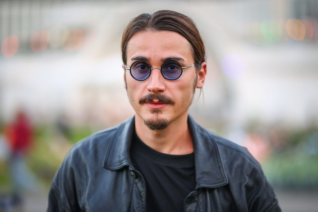
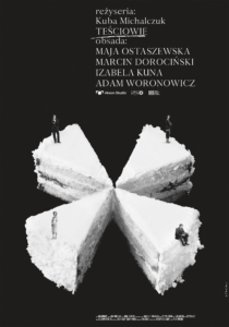
His name is Maks Bereski, but most of you might associate him with the ‘Plakiat’ brand. He has been creating original film posters for 13 years. On a regular basis – often every week – he introduces new posters for new titles. He’s called the continuator of the Polish Poster School and his works are presented on the official website Plakiat.com. I remember each item I’ve designed, they are all related to emotions – says Maks. In Gdynia, he was awarded with the Polish Film Institute’s statuette for best film poster (promoting the film The In-Laws).
Photo: Wojtek Rojek
Interviewer: Mateusz Demski
Did you paint a lot as a child?
Maks Bereski: Definitely. Visual arts have accompanied me since I was born. That’s the way I was expressing myself, it was my private world, with the rules I’ve defined myself. I’m an only child, an observer, so creating new realities (the so-called creativity) was a concept highly appealing, which I was familiar with. As far as my education is concerned, I also followed an artistic path.
You’re a visual artist by education. Did you feel called to make film posters from the very beginning?
MB: I graduated in Fine Arts – that’s right, but ‘Plakiat’ is what it is today, not only owing to my craft but because of my pure unconditional love for film. It’s a kind of tribute. I’m not a Sunday viewer: I’ve watched films in mass volume since I was a child, I’ve read interviews, and I’ve always been interested in the backgrounds of production. I was a great fan of animations and the way these films are made. I was watching premieres at the cinema, and in the morning, I was reading film news and reviews for a few years ahead.
In short: You’re a keen cinephile.
MB: Since I’ve seen Snow White for the first time in 1992 (ed. cinema re-release), trying to touch the screen as a child, I’ve became a loyal viewer. I would define cinema as the most important part of my life, and the cinematography itself as the most beautiful area of arts, combing visuals, audio values, text and immersion. ‘Plakiat’ is not my work – it’s the way of life, especially with the pace and number of titles premiered in the media. If I hadn’t been in art school back then, I would probably have gone to film school.
Was the Polish Poster School an inspiration for you?
MB: It’s still a very important point of reference, however, it wasn’t the sparkle which made me start the brand in 2010. I’ve always had a tendency for minimalism and catching the essence closed in a specific symbol. Not only in a poster. I remember being, as a high school student, an ardent reader of Empire Magazine where minimalistic film posters were presented – one poster per magazine number.
Do you have your favourite authors from the Polish School – perhaps Tomaszewski, Lipiński, Młodożeniec or later Pągowski? Or your favourite poster from the Polish School?
MB: As a visual learner I remember images, not necessarily the names attached to them, but I must mention here names such as Waldemar Świerzy, Wojciech Fangor, Janusz Stanny or Henryk Tomaszewski. Also the posters of Saul Bass and his film ident. I’m interested in specific style, for instance from the 1950s. or 1960s., not necessarily the names.
Speaking of the Polish Poster School, it seems that at some point this period as if burnt out. Posters used to be supported by artistry, some reactions and discussion. Today, they have utilitarian function – they usually show well-known faces grouped in one mass. I don’t want to point out, but some of photographic posters are terrible and just funny.
MB: The approach to the viewers has burnt out. These are times of dull commercial “mash”: people stopped reading, they are no longer excited about culture. We live in the times of an algorithm and politically correct checkbox lists. As I work directly with producers and distributors, I know the reason for that. It’s the approach to the viewers, to a great extent. The very differentiation between an artistic and distribution poster is – as you say – just funny, as EVERY poster should have something artistic in its nature, a poster, as a field of art, is noting indirect. Some producers and distributors (not all of them being masters of intellect, though there are some exceptions) ASSUME that a photographic poster is more intelligible for a viewer and will be liked more. They don’t have higher aspirations.
And a poster with “heads” is actually not more intelligible.
MB: Right, and people won’t like it. Perhaps it’s admiration for the American approach. Perhaps the lack of the feeling of art, which is not thought because of the malfunctioning system of education. Or ignorance and technophobia of older generations for whom the early Photoshop is considered state-of-the-art. The under-financing in Poland can be a reason too. Another problem is streaming: those productions are not films anymore, but content and the filler of streaming platforms, and posters are very often just photos with subtitles. It’s imitative and offensive to viewers. “Photos with subtitles” – that’s what I call it.

Each of your posters constitutes a unique dialogue with a film. How are your posters made?
MB: Every poster is made in a unique way as every film is different, and I don’t stick to one technique. Having watched a film or read a script, and when I access all the available information – if a film is in pre-production – I keep imagining the poster for the next few days. And then I work on it, based on what I saw in my head. Nowadays, the entire process takes me a week. I don’t make drafts or ‘versions’. I keep thinking what I want to say by the poster and how to do it, and then I just make it. A director or producer sees a ready-made product. I totally love reading or listening to the creators’ reactions. I’m delighted to read I’ve hit the nail on the head. When I’m creating, I’m entirely devoted to the project. I have no weekends, holidays, or any disturbing breaks. I have my task to be done – the film crew counts on me, the material will become a part of an archive, have a number assigned to it, it will be promoted and sold. I put my signature on it. I can’t let anybody down. I don’t want that. I’ll be very critical of my works and I’ll be very demanding with myself.
Andrzej Pągowski told me once, while he was watching a film, his brain was making screenshots at the same time. He would pick out a detail and put in on paper. Do you have similar experience?
MB: My brain makes screenshots all the time. I guess it’s neuroticism [laughter]. I interpret a film, analyse the content, colours, emotions and the moral of the story. I paint by hand, I draw, cut, paint digitally with a mouse (without tablets, as I hate blurred digital paintings pretending hand-painted works), I make vectors, fonts, installations, I take photos. All that to make me show the material in an intriguing way.
Do you also listen to film music for inspiration?
MB: Music making a reference to a given subject. When I was working on Once Upon a Time in Hollywood, for instance, I listened to 1970s records. While working on Birds of Prey, I listened to the film soundtrack. Working on Napoleon, I listened to Beethoven. The mood I get myself in, lets me feel the atmosphere of what I’m supposed to make. That’s why on the ‘Plakiat’ Instagram, I make film teasers as introductions – invitations for viewers to see the latest posters. Sometimes I edit those trailers just before the poster is ready, so that I could close the message in 15 seconds, that’s the time one report allows for. That makes it easier for me to understand how I really want to promote the poster. A video material is also an interesting bonus in terms of promotion.
Are all your posters make on a computer or do you use traditional techniques?
MB: Most of my posters are made with the use of traditional techniques however, they are combined with digital techniques. It’s a combination of retro and contemporary styles I’ve developed. There are also exclusively computerised and digital posters.
Your works are often minimalistic, but at the same time ambiguous. I recall the poster for the Oscar-nominated The Dress by Tadeusz Łysiak. Tell me more about the idea of the mannequin with a pin stuck into it.
MB: A naked torso of a female mannequin presenting a dress which it doesn’t have on. It’s a monolith telling about problems: the scale of physical dysfunctions, the lack of shops for persons with dwarfism (or reminding that the dress was taken off and given to the protagonist). The motif refers also to female shapes, as it’s a film about femininity and the search for it. The pin stuck into heart suggests the aspects of feelings, love, a tragic end of a story. A monochromatic world. Tailors often have little pin cushions in the heart shape. It was a big fun to make this poster, especially that – as usual – I was free to do that. The poster was very well received by Tadek, and the production crew. And I’m happy it went to Hollywood.
A few days ago, I came back from the Venice festival, where your poster for Bread and Salt by Damian Kocur, awarded in Orizzonti section, was very conspicuous. How did you come up with the idea of a stave? Where did the stave came from?
MB: It’s a composition based on the idea to use the musical notation – a film symphony of Bread and Salt, where the characters, in poses typical to them, serve the function of music notation. Tymek – an aspiring pianist seats alone, staring thoughtfully, turned his back on the viewer, looking at the migrating birds. Below you can see casual (also aggressive) games of his colleagues, physically and mentally distant from Tymek’s worldview. His brother, Jacek, is among them. Each figure is taken from a different scene (also the figures in a group, which make the collage). The colours of the piano, minimalistic approach. A film as a symphony, a plot as a melody, and protagonists as notes. When I was making the poster, no one had imposed anything on me, neither Damian, who commissioned the poster, nor the film producer – Munk Studio. I wanted to highlight the fact that Tymoteusz was a pianist and we saw the world from his perspective.
Your portfolio includes also posters for The Maids of Wilko by Andrzej Wajda and Night Train by Jerzy Kawalerowicz. Do you like coming back to classics from time to time?
MB: Definitely, I like coming back to classics. Both posters were commissioned by the Polish Filmmakers Association. Night Train is one of my favourite Polish films. It’s great this film was committed to me, on the occasion of the film’s re-release and DVD special edition. In many cases I find myself better in the past – what’s happening now is a crying shame. I’ve recently read some wise words of Jan Englert regarding the present times.
And what’s a good poster according to you?
MB: As an active creator I should say: “what my film poster is”. The notion of “good” does not exist, it can make radically different forms depending on who’s making the message. Note, I don’t call ‘Plakiat’ the ‘Maks Bereski Art’. I would find it pretentious to impose on anybody the term “art”. Besides, that would be quite immodest and intended on impressing with the name. I believe a poster should be made according to the rules of art – have a composition made by a person engaged in visual arts and ‘visualia’. It should stimulate reflection and be a mental charade for the viewer. When I see photos, even with imagined red and violet filters, with no idea, except for the aesthetics of the pasted photo, I’m sick. Let’s do not forget about thinking.


